Project Date: November 8, 2016
Mapping Out a Plan
In early 2015, a coalition group representing parks, historic preservation, and affordable housing began planning a potential campaign to implement the Community Preservation Act (CPA) in Boston. The meetings quickly spread to City Hall, where Mayor Walsh and his staff began to decide whether this was the time to move on the CPA and if the Mayor would support the proposal.
While planning was underway, CK Strategies engaged with this coalition, later named the Yes for a Better Boston campaign, to develop a strategy to get to the ballot and a win. That started by engaging a pollster who knew the intricacies of Boston and the critical questions that needed to be asked.
September 2015 Poll Results
Our pollster conducted a live phone survey in September 2015. High level findings included the following:
- A majority of voters support CPA (64% yes / 30% no).
- The majority of respondents (64%) thought affordable housing was a higher priority than parks and recreation (15%) and historic preservation (15%).
- Swing voters tend to be people of color, home renters, older voters, those without a college degree, and self-identified moderate or conservative Democrats.
- Voters in favor of CPA tended to be women, particularly younger women, women without a college degree, and women of color. Supporters are also likely to be Democrats, renters, and people without children.
Though voters consistently expressed a discomfort with the tax increase attached to the plan, the support for CPA only increased by a small margin (+6) when voters heard the cost the average homeowner faced each year.
Positive messaging about CPA increased support 9 points, while negative messaging about CPA had little impact on support levels (from original 64%). However, sustained and unanswered negative messaging, particularly around transparency, could pose a serious threat to the CPA.
For details, see Attachment A: Survey Findings & Analysis memo.
A Campaign Begins
In spring of 2016, the City Council officially voted to place CPA on the November ballot. Weeks later, Mayor Walsh endorsed the campaign and the Yes Better Boston Committee was officially formed. We immediately went to work, developing a budget, hiring a staff and expanding the coalition. As the campaign progressed, it became clear that our major obstacle would be fundraising and we would have to make difficult decisions about cutting areas of the budget. Ultimately, we decided that keeping the investment in our modeling project would serve us well long-term. We would know our exact targets and focus on them exclusively via mail and digital ads, and through volunteer activities where applicable.
Model Results
Our data partner created a model to target and identify likely CPA supporters based on criteria such as:
- Liberal ideology / partisanship
- Education level
- Number of years registered to vote in Boston
- Voter turnout scores
- Mortgage down payments and monthly payments
- Mortgage types
- Home equity trades
Through this, over 375,000 registered Boston voters were scored from a range of 0-100, representing the likelihood that a person would support the CPA ballot question. The following sub-groups are most likely to be CPA supporters:
- Females
- Voters under age 45 band over age 75
- Voters who did not complete high school
- Democrats
- Lower turnout voters
- African American or Hispanic voters
For details, see Attachment B: Model Release Notes.
Results Following the Model
In the geographic areas where we expected to do poorly (comparatively) based on demographics and the model – South Boston, Orient Heights (East Boston), Charlestown, West Roxbury, parts of Dorchester – we saw a combined Yes average of 59.45%. These areas were largely white, more conservative populations, and marked by higher income levels and high rates of homeownership. These numbers remained nearly identical to the poll results from September 2015.
In areas that were majority white populations and known as progressive – Allston, Brighton, Fenway, Jamaica Plain, South End – we saw a combined Yes average of 79.27%. We were able to target these areas through our model and execute an aggressive field operation with our strongest campaign partners / coalition groups.
In communities of color (CoC) and ethnically diverse areas – Hyde Park, Mattapan, Roxbury, Chinatown, parts of Dorchester – we saw a combined Yes average of 80.76%.
The results in the Progressive, CoC and ethnically diverse regions of Boston far outpaced the September 2015 polling (by over 10%) and outpaced the model projections significantly as well. There is a direct correlation between these results and our voter contact strategies derived from the model. Our highest number of targets came in the progressive, CoC and ethnically diverse areas. In turn, our mail, digital ads, text messaging GOTV program and our poll coverage was highly targeted within these regions. The results were clear: we over-performed our expectations across the board, lowered the drop off (blank) voters by over 4% in our best targets, and beat expectations by 7% within the city.
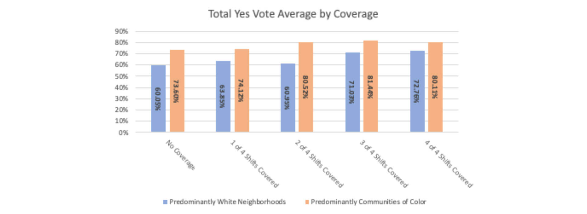
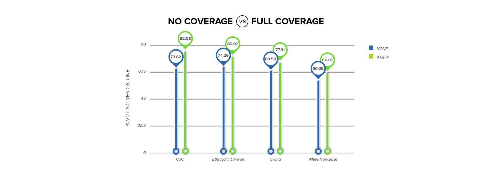
Results by Coverage
There were four available shifts on Election Day:
- 6:45 – 10:00 AM
- 10:00 AM – 1:00 PM
- 1:00 – 4:00 PM
- 4:00 – 8:00 PM
We saw a marked improvement in the total Yes vote average for the areas where we had polls covered by volunteers who were directly engaging with voters.
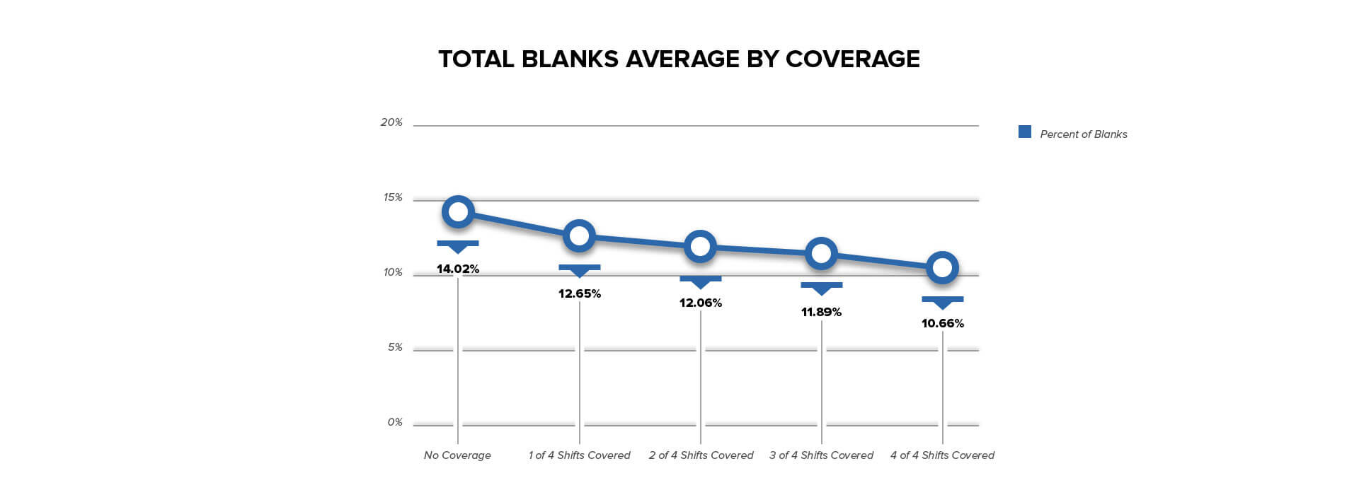
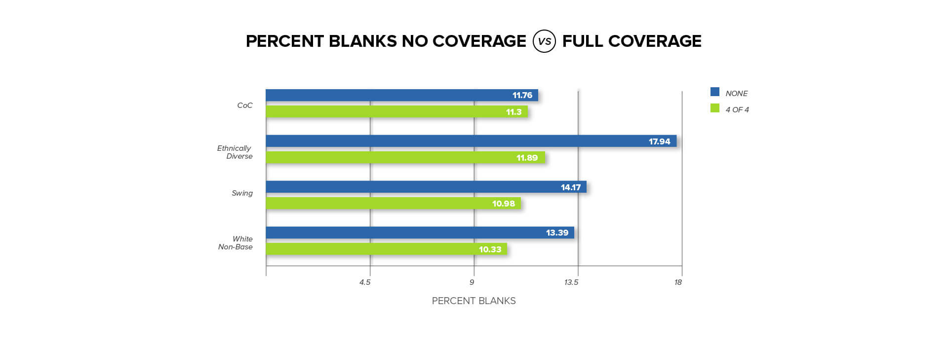
There was also marked reduction in ballots left blank on Question 5. Blanks were a main concern of our campaign from Day 1. As you can see below, we reduced our blank % significantly as our coverage increased. There is a clear correlation between our efforts to have direct voter contact with voters at the polls and a reduction on the overall percentage of blanks. Furthermore, our question was the last on the ballot and stood alone by itself of page 4. Our budget was approximately $450,000 and we were unable to go on television. Conversely, Question 1 had a multi-million dollar media buy and ended up having a higher percentage of blanks than Question 5.
An Example: North End
An illustration of the difference between using polling and using modeling can be seen in the instance of North End. Had we just followed our poll results, the North End likely would not have been on our radar screen in a strong way, given the economic and demographic data that identify a North End resident (predominantly wealthy or older, white homeowners). Because of the model, we could drill this information to a person-by-person basis, and immediately understood that the North End would be a strong target area for us.
Conclusions
In reviewing the results of this election, we over-performed both the initial polling data and the model. Through our modeling, we excluded individuals with a score below 60 from our paid voter communications outreach. The win margin suggests that we pulled in a significant portion of those people with a score 60 or below, which we can attribute to our aggressive early vote efforts and strong Election Day coverage at the polls. Through this work, we won our target (individuals with a score of 60+ in the model), and we also we persuaded our swing voters, even those we would consider low to moderately unsupportive (an additional 5-8% of people considered highly unlikely to support CPA in our model).
Polling tends to focus on demographic information, which leads a campaign to miss people and opportunities. We pinpointed targeted voters and all decisions were made around this – what we could accomplish through mailers and digital advertising, and what we could accomplish with a limited volunteer capacity.